Café Gratitude
Brand Identity, Packaging & Website Design
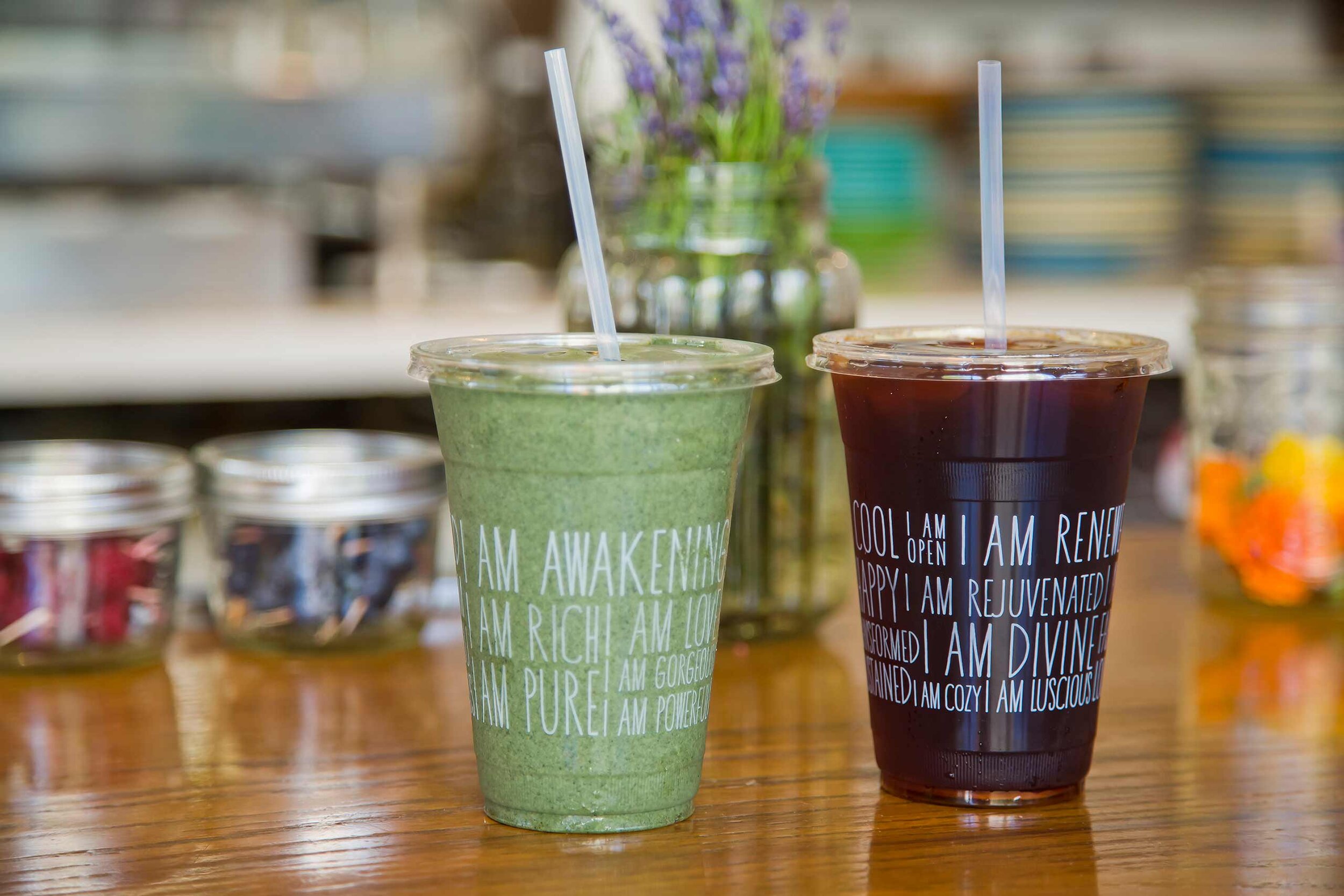
Before it was a fixture on the L.A. dining scene and a magnet for celebrity diners, Café Gratitude was founded in the Bay Area with the simple ethos that joy derives from loving and being grateful for food, health, and good company. The dishes are named to double as affirmations of self. "I Am Fearless," "I Am Humble," and "I Am Open-Hearted" nod to the restaurant's core belief that food is just as much about spirit as it is about appetite.
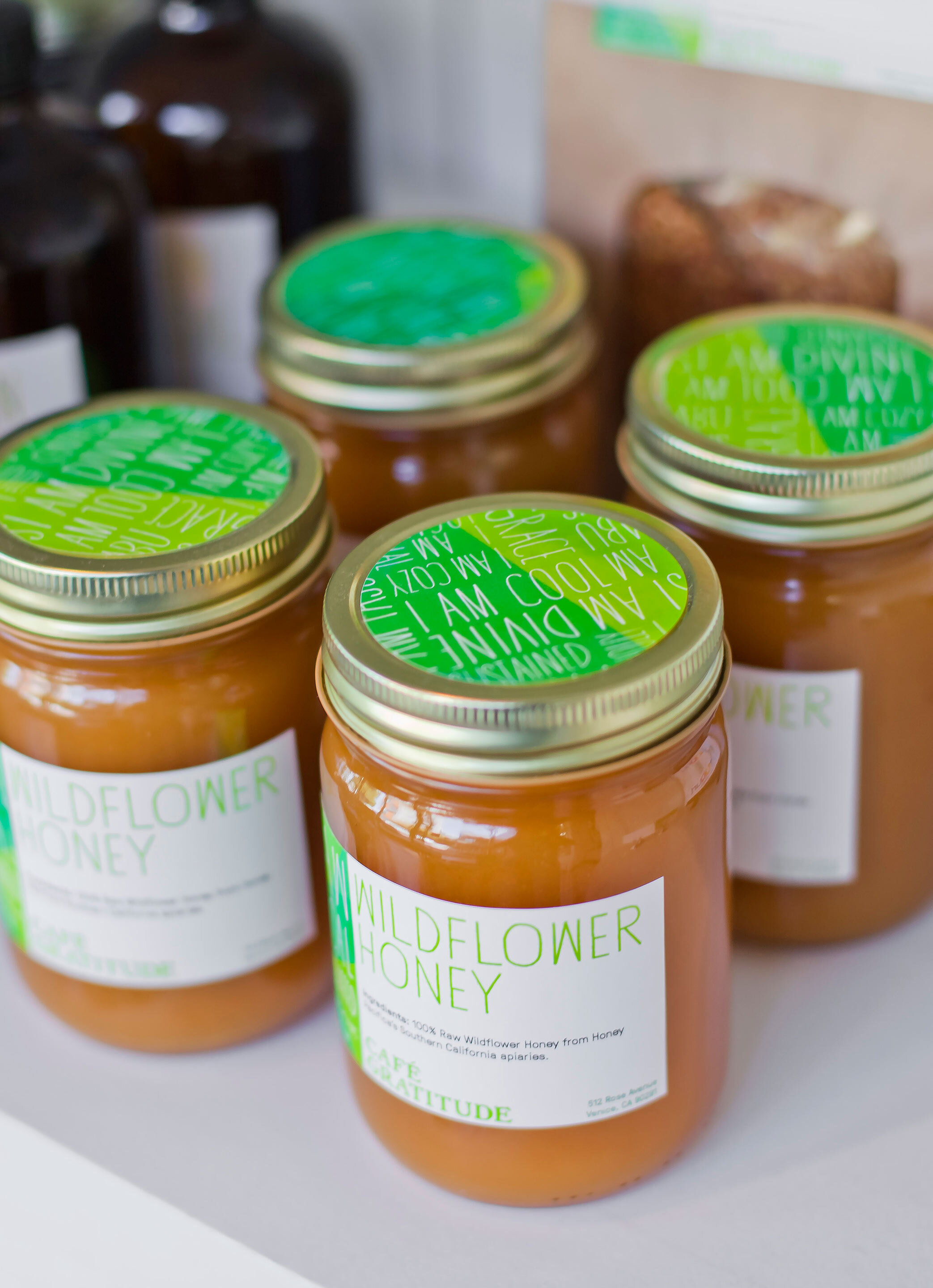
As the brand expanded and added locations, we were asked to streamline the visual identity into a flexible system that would embody the core values of the brand, and reflect the fresh, healthy and hip attitude of the locations, while making sure the founding principles remained the same, and the food continues to celebrate the flavors of plants with organic, from-scratch, and healthful ingredients free of animal products, processed soy, and, in almost all cases, refined sweeteners.
The new brand identity unified the experience at all the restaurants, while maintaining each one’s personality so it never feels like part of a chain. We simplified the multitude of graphics systems with a single logo that allowed each restaurant to add its own location. The existing logo had a lot of technical issues. While we retained its handmade quality, it underwent a lot of subtle tweaks, ensuring that it could be better reproduced on a multitude of applications, mediums and scales.
We also introduced a typographic palette that improved legibility, worked closely with a renowned photographer to develop a stronger image library, as well as photography principles to follow for future shoots. Finally, we established brand identity guidelines so the organization would have room to grow in a consistent way after our work was done.
Project completed at Rios Clementi Hale Studios — All Images ©Manolo Langis


