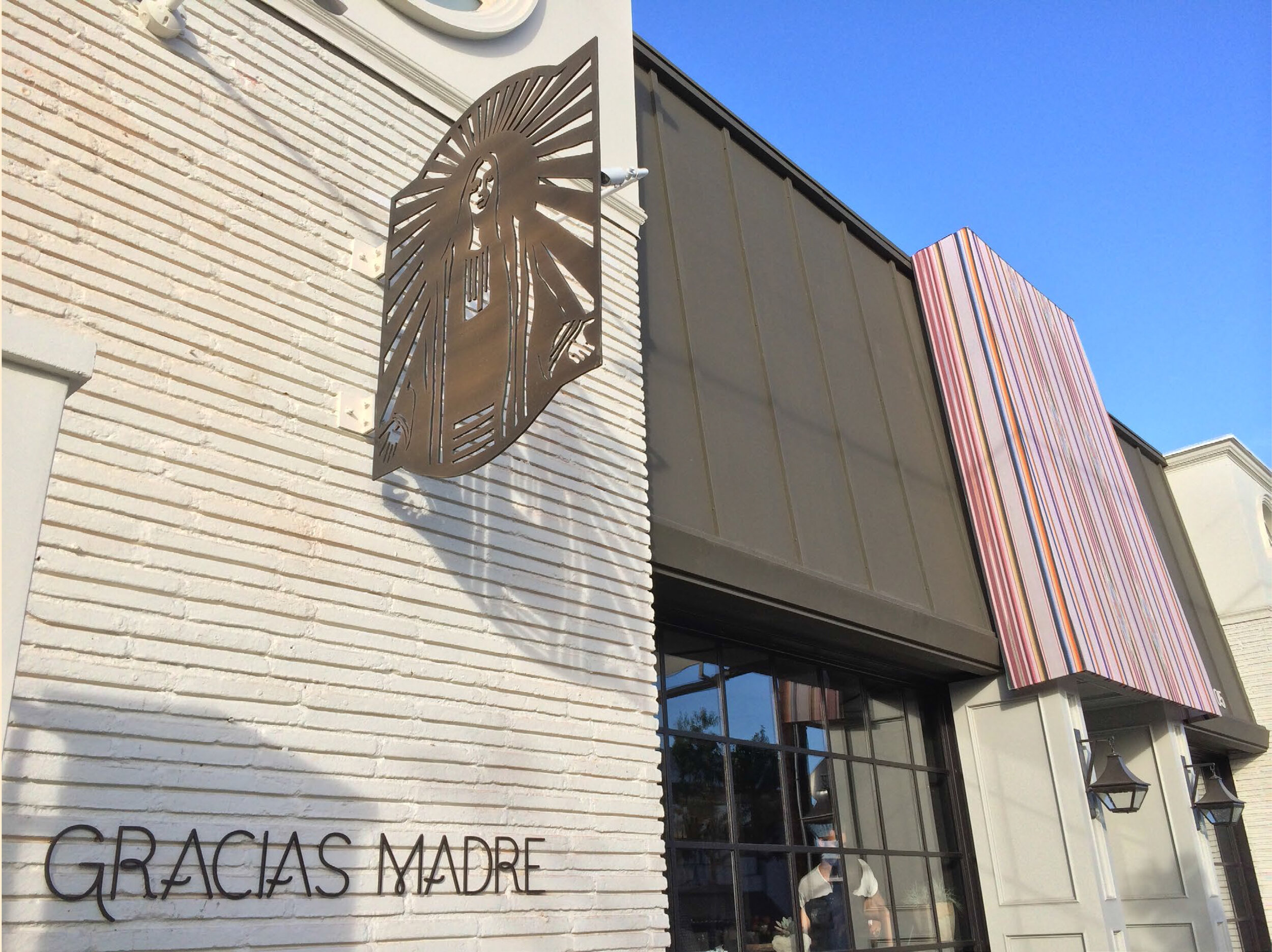
Gracias Madre
Brand Identity, Graphic Design, Signage
Gracias Madre offers a Mexican-Californian fusion of plant-based soulful handmade cuisine. Known for their deep love of and reverence for food, commitment to health and sustainability, and their unconditional love of community - Gracias Madre’s brand identity is an expression of these core values. As the brand evolved from a neighborhood joint located in San Francisco’s Mission district to an upscale dining destination in West Hollywood, we were asked to refine its complete visual identity, while retaining some of the original spirit.
The main elements of the brand identity consisted of a logotype, the “Mother” icon, and a set of serape-inspired patterns.
The wordmark, a single-line … was developed from the iconic mosaic mural featured on the walls of the original San Francisco location, and adapted to reflect the brand’s desire to grow into an upscale dining experience. The mark was carefully designed to work across a variety of print, digital, and signage applications
Project completed at Rios Clementi Hale Studios — All Images © Manolo Langis + Whitney English


