notNeutral
Brand Identity & Website
In 2021, notNeutral’s marked its twentieth anniversary with a new visual identity. Re-imagining the brand for the first time in twenty years was not about changing who they are — it was about defining a visual identity that better represents who they’ve become. The redesign revolved around a central goal: reflect the many ways notNeutral has evolved over the years and the values that remain at the center of who they are as a company.
Before
After
Working closely with the notNeutral team, we helped them articulate their core values, assessed the competition and market, identified what makes them stand out above the rest, and developed a visual identity that clearly communicates their value to their target clientèle: top-tier coffee shops around the world.
This renewed sense of focus can be seen in the clean lines of the redrawn logo, which was designed with performance in mind, allowing the brand to be expressed adequately on a variety of touchpoint, including websites, packaging, product stamps, and marketing collateral. Additionally, we created a memorable avatar based on the brand’s initials (nN), to allow for a more prominent social media presence.
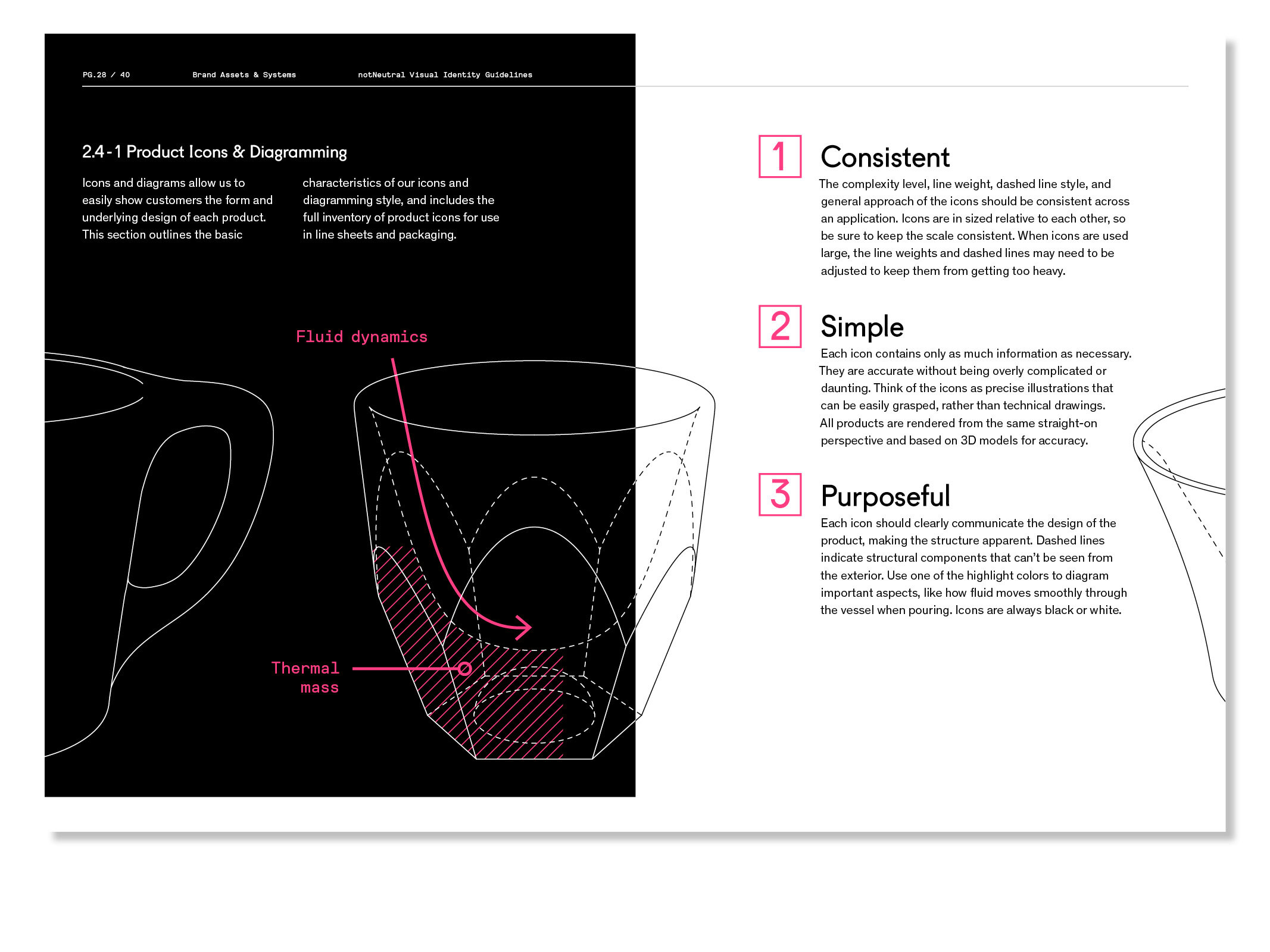
The new identity combines two of the core values of the brand: precision and humanity. Inspired by notNeutral’s products and process, we created a system that provides the technical rigor expected from a high-end commercial-grade product line, but left room for elements of surprise, beauty, and delight.
Project completed at RIOS


